\"Angry Kirby\" Explained by Former Nintendo Employees
Author: Zoe
Feb 28,2025


This article explores the evolution of Kirby's image in Western markets, revealing why the adorable pink puffball sometimes sports a more "determined" look. Former Nintendo employees shed light on the localization strategies employed, highlighting the differences between Japanese and American marketing approaches.
A Tougher Kirby for Western Audiences?
The "Angry Kirby" phenomenon, as fans dubbed it, stemmed from a conscious decision to make Kirby appear more appealing to Western audiences, particularly boys. Former Nintendo Localization Director Leslie Swan clarified that the intent wasn't to portray anger, but rather a sense of resolve. While cuteness resonates universally in Japan, Swan noted a preference for tougher characters among American tween and teen boys. This aligns with comments from Kirby: Triple Deluxe Director Shinya Kumazaki, who acknowledged the contrasting appeal of cute versus determined Kirby in Japan and the US respectively. However, he also pointed out that this varied depending on the game, with Kirby Super Star Ultra featuring a tougher Kirby on both US and Japanese box art.
Marketing Kirby: Beyond "Kiddie"
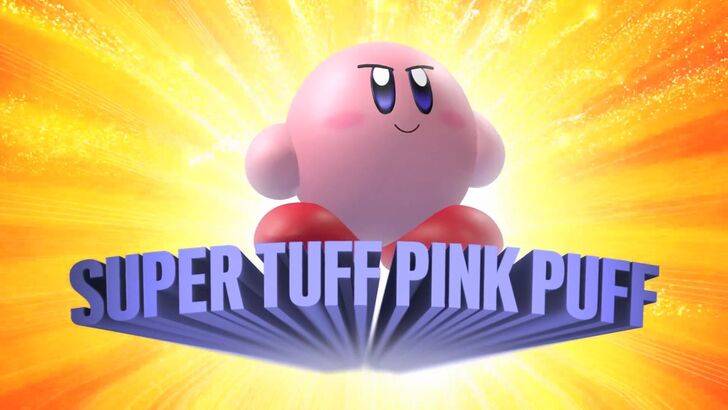
Nintendo's marketing strategy aimed to broaden Kirby's appeal, moving beyond the "kiddie" image. The "Super Tuff Pink Puff" tagline for Kirby Super Star Ultra exemplifies this shift. Former Nintendo of America Public Relations Manager Krysta Yang discussed the company's desire to shed its overly-childish image during a specific period. The focus shifted towards highlighting Kirby's combat abilities to attract a wider demographic. While recent marketing emphasizes gameplay and abilities, Yang acknowledges that Kirby's cuteness remains his primary identifier for many.
Localization Choices: From Ghostly White to Determined Expressions
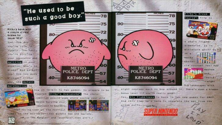
The divergence in Kirby's portrayal between Japan and the US began early. A 1995 "Play It Loud" advertisement featuring a mugshot-style Kirby is a prime example. Subsequent game box art often depicted Kirby with sharper features and more intense expressions, particularly in titles like Kirby: Nightmare in Dream Land, Kirby Air Ride, and Kirby: Squeak Squad. Even Kirby's color palette was altered; the original Kirby's Dreamland for Game Boy featured a desaturated Kirby in the US release due to the monochrome screen, a decision that later impacted marketing strategies. The shift towards a tougher Kirby on Western box art was a direct response to marketing needs. In recent years, a more consistent global approach has emerged, with Kirby's image fluctuating between serious and cheerful across all regions.
A More Globalized Nintendo?
Both Swan and Yang concur that Nintendo has adopted a more global perspective in recent years, fostering closer collaboration between its Japanese and American offices. This has led to more consistent marketing and localization, minimizing regional variations in character portrayal. While this ensures brand consistency, Yang acknowledges potential drawbacks, including a possible homogenization of marketing that could lead to less distinctive campaigns. The current trend towards less regionalized localization is also attributed to the industry's globalization and the increasing familiarity of Western audiences with Japanese culture.